Industry
Part of People by US state: what to keep and what to drop
9 things that shift an annual people by US state count in 2027
People by US state by year counts reflect record access, registration histories, boundary changes, and cataloging choices—not simply where people were born.
A chart of notable people by US state by year looks like history. It is mostly a record of how the dataset behind it was built. Nine things move the 2027 numbers, and only one of them is the world.
What to take away
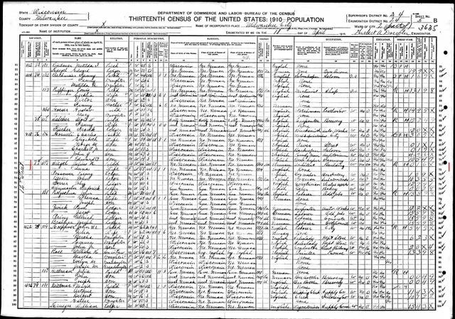
- The 1950 census opened in April 2022 under the 72-year rule; the 1960 census opens in 2032, so a 2027 count still rests on 1940 and earlier for full federal coverage.
- Statewide birth registration arrived at different datesMassachusetts in 1841, New Jersey in 1848, Pennsylvania in 1906, and Texas did not reach full compliance until the 1930s.
- A 2027 count is a flow of records, not a stock of living people. The two are not interchangeable.
- Reconstructed dates pile up on years ending in zero and five. Check for that spike before you explain anything.
- Name the year field on the axis. A single "year" column assembled from several sources hides which one it is.
Six things that move a count
- An ingestcollection imported, line jumps
- A rule changethreshold revised, all years shift
- A digitization programone archive, one state
- Documentation lagrecent years always sparse
- A jurisdiction changerecords land elsewhere
- A registration lawartificial onset year
The nine factors
1. The 72-year census release. Federal population schedules stay closed for 72 years under the 1952 agreement between the National Archives and the Census Bureau. The 1950 census opened on April 1, 2022, and the 1960 census opens in 2032.
A 2027 count therefore has no federal census coverage between 1950 and 2032, which pushes weight onto state and county records for anyone born after 1930. The National Archives explains the schedule in its guide to census records.
2. Statewide vital-records registration. Massachusetts required statewide registration in 1841, New Jersey in 1848, and Pennsylvania in 1906. Texas did not reach full compliance until the 1930s.
A state's series shows an artificial onset at whatever year its records begin to survive in quantity, not at the year its people began to be born.
The Archives points researchers to state offices rather than a national register for vital records. For the states named here, those offices are the Massachusetts Registry of Vital Records and Statistics, the New Jersey Office of Vital Statistics and Registry, the Pennsylvania Department of Health's Division of Vital Records, and the Texas Department of State Health Services Vital Statistics Section.
3. County boundary changes. Virginia's counties have been redrawn repeatedly, and the Virginia counties that became West Virginia in 1863 carry records in two states. A person born in what is now West Virginia before 1863 belongs to Virginia in any dataset keyed to modern boundaries.
4. Dataset ingests. A collection is imported, a partner archive is merged, a language edition is added. The line jumps on the import date and spreads backwards across the years the collection covers. This is the largest single cause of structure in these charts, and the easiest to check, because projects keep release notes.
5. Digitization programs. A funded scanning effort lights up one archive, one state, one period. The bump is a fact about a grant, not about the place. The National Archives catalog and state digital libraries publish their digitization priorities, which is where to look before reading anything into a spike.
6. Documentation lag. Coverage of any year keeps accumulating for decades. Recent years are always sparse, and the sparseness is not a decline. Truncate the last several years or shade them as incomplete, and never fit a trend through them.
7. Inclusion rule changes. A notability threshold is revised and a whole class of entries appears or disappears at once, across all years simultaneously. Simultaneity is the tell. A change that hits every year on the same date is a rule, not an event.
8. Round-number reconstruction. Historical dates are often reconstructed rather than registered, and reconstruction has a signature: values pile up on years ending in zero and five.
Ages reported in censuses and depositions show the same digit preference, and any birth year derived by subtracting a reported age inherits it.
Plot the last digit of the year and the spike is obvious.
9. The 2027 reference year itself. A count labelled 2027 is a count of what the project had catalogued by the time it ran the query. Projects that update on a rolling basis will show a different 2027 in January than in December. The state pillar sets out which custodian holds each date field.
Five year fields, five different charts
One person carries several dates, and each produces a different series from the same records.
The series describes
- Birth year
- A cohort
- Event year
- When something happened
- Publication year
- When a work appeared
- Record year
- When a document was created
- Entry year
- When the database row was added
Where it misleads
- Birth year
- Nothing that person did appears near their position on the axis
- Event year
- Requires the event to be dated, which thins the set
- Publication year
- Lags the work, sometimes by decades
- Record year
- Registration lag, and delayed filings
- Entry year
- Purely a fact about the project
Mixing these inside one chart is common and invisible. If a dataset has a single "year" column assembled from several sources, find out what populated it before you plot it.
Five year types compared
Year plotted
- Birth year
- A cohort
- Event year
- When something happened
- Publication year
- When a work appeared
- Record year
- Document created
- Entry year
- Database row added
Series describes
- Birth year
- Nothing that person did
- Event year
- Thins the set
- Publication year
- Lags by decades
- Record year
- Registration lag
- Entry year
- Project fact only
Where it misleads
- Birth year
- Event year
- Publication year
- Record year
- Entry year
Stock, flow, and what is being counted
A flow is how many events fall in a year: births, deaths, publications. A stock is how many people were alive, resident, or active in that year, which needs spans rather than points. A cumulative count rises forever by construction and says nothing about any individual year.
Charts that switch between these without saying so are common. A "people by state by year" series is nearly always a flow of records, and readers nearly always read it as a stock of people. Period bucketing can conceal the same distinction.
What a 2027 series can and cannot show
A year-by-year view is good for locating discontinuities in a collection, which is the fastest way to understand how a dataset was built. It is good for assessing coverage before using the data for anything else, and for comparing a state against itself over a period where the method did not change.
It cannot show how many notable people a state had in a given year. That quantity is in no dataset.
It cannot support a comparison between states with different registration histories, which is most pairs, or any per-capita rate for early periods, where the population denominator is itself a reconstruction.
Such a ranking orders archives, not people.
Common questions
How many recent years should be cut from the right-hand edge?
Enough that the slope stops being an artifact, and the number depends on how fast your sources accumulate. Say what you cut and why rather than picking a round number silently.
Is the digit preference at years ending in zero fixable?
Not in the data. It can be shown: plot the last digit of the year and the spike is obvious. That is more honest than smoothing it away.
Should an ingest be annotated or excluded?
Annotated. Excluding the affected years hides the fact that the series records collection activity as much as history.
Can two states be compared on a per-year series?
Only where both registration histories and both coverage histories are known and similar. Otherwise the comparison measures two registration regimes.